FieldEdge
Complete
Work Order
Improving the experience of Completing a Work Order on mobile.

Summary
Platform
Mobile
Problem
Three problems arose in completing a Work Order in mobile: too many taps to reach the 'complete' page, unnecessary error messages shown throughout, and no differentiation between user types on the 'complete' page.
Solution
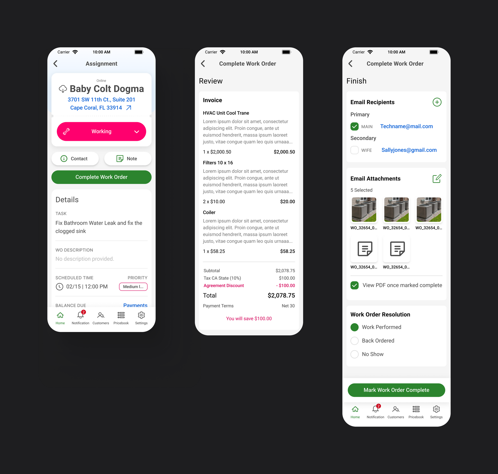
Simplified flow by providing two direct paths to the 'complete' page, implemented logic to ensure all necessary tasks were finished before accessing the ‘complete’ step, and split the completion process into three sections across two screens: one for customers and the other for Techs.
Impact
Reduced the number of taps to complete by 63%.
Testing revealed that 92% of Members found the 'complete’ process intuitive.
Background
In FieldEdge, Techs receive their assignment via a Work Order in the FieldEdge mobile app while out in the field.
Within a Work Order, Techs:
- Review customer information and the issue
- Create Invoices and/or Quotes
- Fill out forms and checklists for their company
- Choose Equipment
- Submit Part Requests or record Expenses
- Capture signatures and process payments
When Techs are finished with their assignment, they need to mark the Work Order as ‘complete’. This is where they review the final Invoice/Quote, get a signature from the Customer, collect payment, and select who should receive the email once done.
Note: FieldEdge is currently building a brand new mobile app, and these designs are for that new build. App should be released in Q1 2025.

The Problem
Completing the Work Order is crucial for Technicians, yet there were three core problems with the experience.
Problem #1
Accessing the ‘complete’ step required the user to swipe through a seven-page carousel.
A carousel makes sense if all Technicians follow a uniform process. However, our research disproved this theory.
For instance...
- 78% of Techs didn't utilize Non-Billable Items
- 74% of Techs didn't initiate Part Requests or Expenses
- 63% of Techs seldomly added Agreements while in the field

Problem #2
The Tech could do various things on the ‘complete’ screen, even if all the Work Order requirements were not fulfilled.
This led to jarring errors upon tapping "Complete," requiring users to return and address mandatory requirements.
Problem #3
The ‘complete’ step serves two users:
1. The Customer
Reviews the Invoice/Quote, makes a payment, and captures their signature.
2. The Tech
Verifies work performed, selects email recipients, and decides on attachments for that email.
However, the design failed to distinguish between these two users, and the information hierarchy did not align with this distinction.
The Solution
In addition to aligning with the new app's UI, we tackled the three issues directly.
Solution #1:
Replaced the carousel design and introduced two direct ways for users to access the 'complete' step, to reduce taps and swipes:
- Tapping the Complete Work Order button on the Work Order homepage
- Selecting the 'complete' option from the Work Order status dropdown menu

Solution #2:
Implemented logic to disable the Complete button and the Complete option in the Work Order status dropdown until all mandatory requirements were fulfilled.

Solution #3:
Redesigned the 'complete' step to be divided into three sections across two screens.

The first screen is tailored for the Customer, with the Review and Pay & Sign sections (shown in two images).
The second screen is dedicated to the Technician, with the Finish section.
Impact
The new app is not scheduled for release until 2025, but testing with Members has shown positive feedback on the design.
92%
of participants found the new complete process intuitive
63%
decrease in the number of taps to complete the Work Order
Prototype
More Work
Web
Mobile
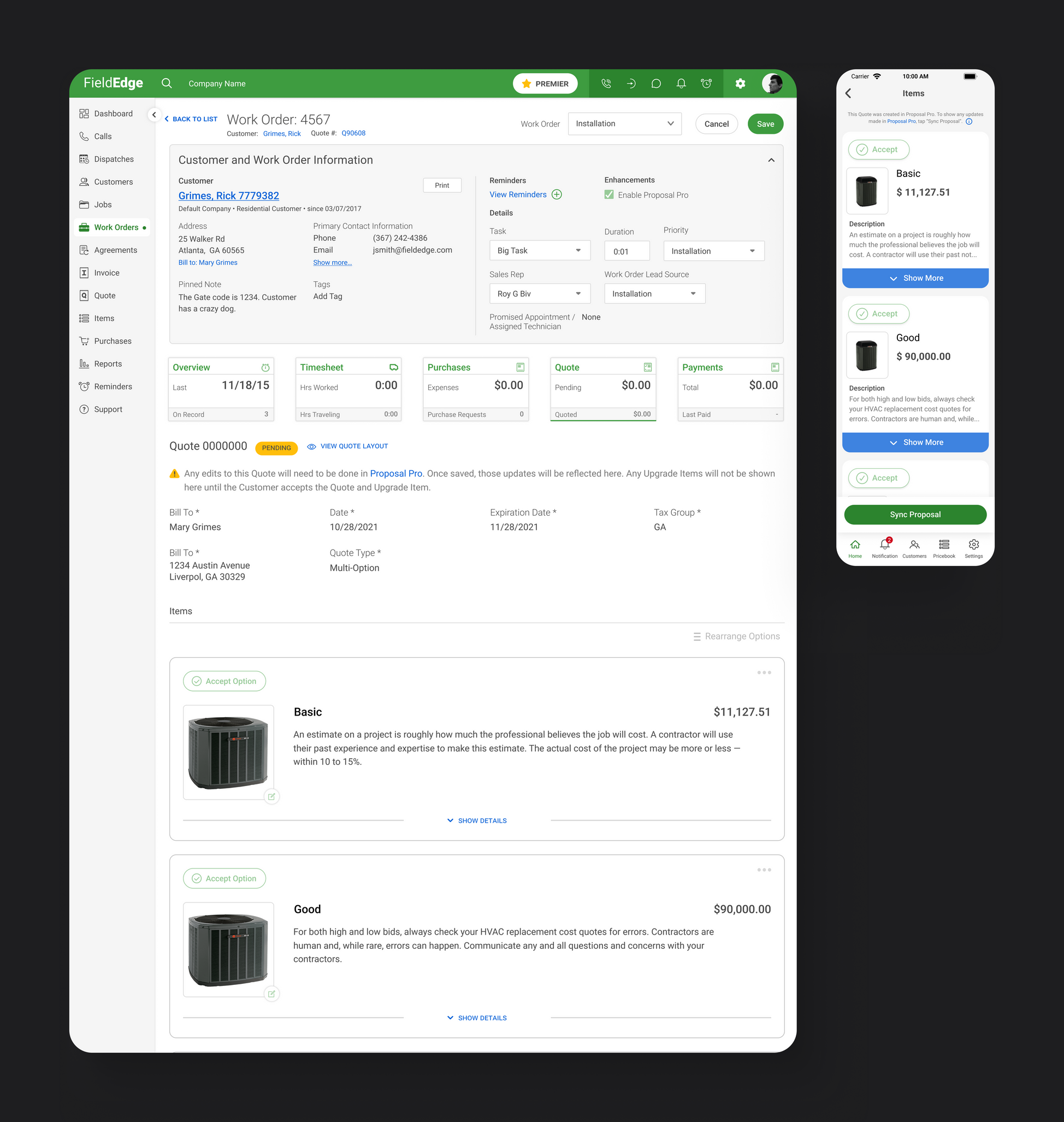
Integrating the ESS Proposal Pro tool into FieldEdge to create more enhanced Quotes.
SuperAdmin Plans & Billing
Web
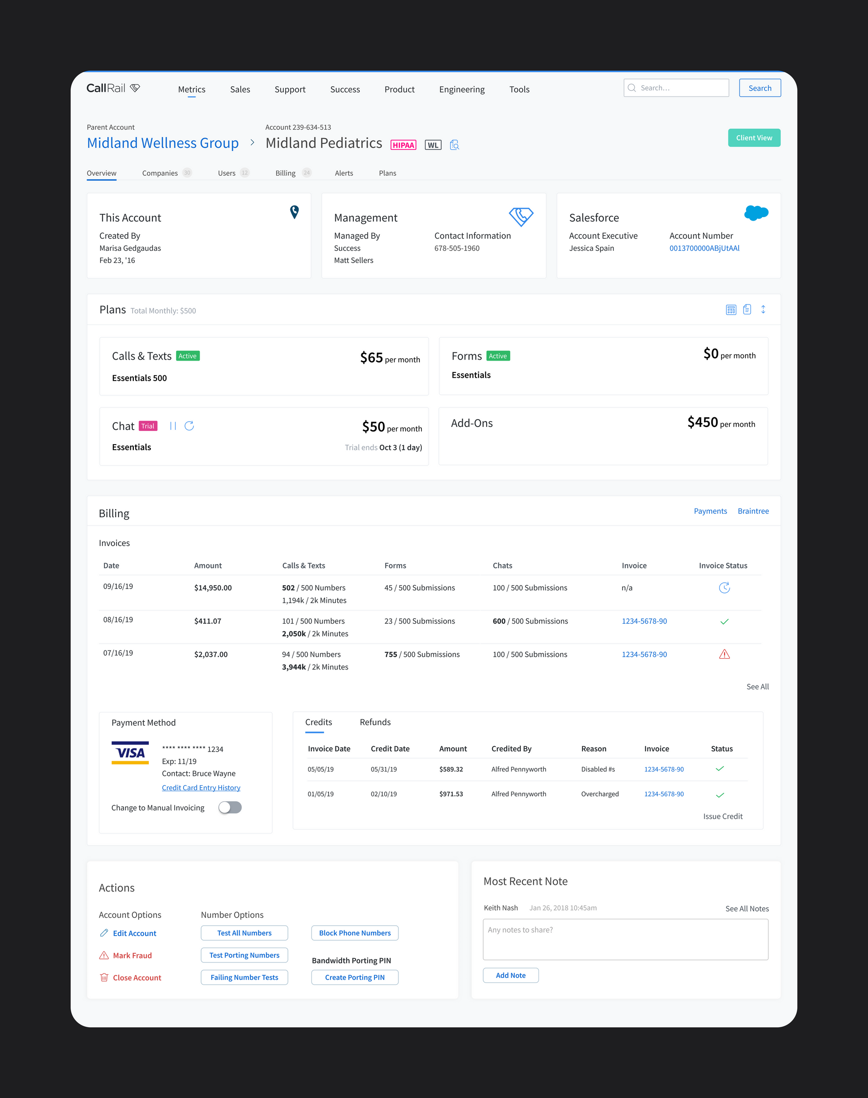
Redesign of the Plans & Billing sections of the SaaS company's internal software.


